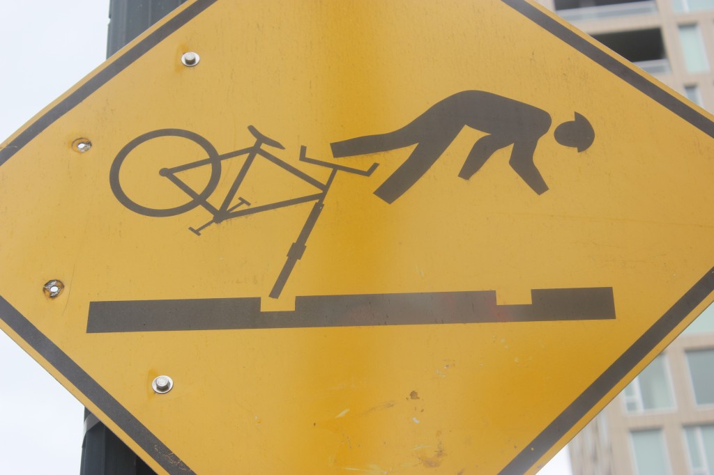
We’re expanding the range of our blog From time to time, there will be interesting things here about design and communications. You don’t think you foodies are affected by those issues? You think that stuff is all the domain of advertising guys whose grandfathers were on MadMen?
No, any foodie, any cook is deeply affected by design and communication. If the layout of a cookbook is not strong, you are not really going to enticed to use it. Font style and size, paper quality, and the flow on the paper of all the type and pictures has to be geared to easy reading and, more important, swift comprehension.
If a recipe is not presented in a smooth, natural matter that you can flow with, then making that recipe will be a pain, not a joy, and you run the risk of striking a recipe iceberg. Have you ever had the experience of reading one paragraph in a recipe, going off to do work, and then continuing on with the recipe – only to learn that you began reading again in the wrong paragraph? Or even worse, you never discover that you’ve missed a chunk of that recipe. You begin baking the cake and notice those unused eggs on your table. Alright, you’ve never been that stupid. I have.
Our frantic, digital world can drive us nuts at times. We all seem to be doing too many things too fast and all at once. So, as consumers, we really have a need and right to have things presented to us as clearly as possible. We aren’t dumb. But we are busy.
Which brings me to my first example, that photo above. It’s an example of design that is effective, but not for everyone.
“Have you ever seen a sign like that?” Suzen pointed out this bizarre traffic warning sign to me. We were in Portland, in the Pearl District, on 10th Avenue NW. A trolley ran by.
“Maybe it’s because of the trolley tracks,” I said.
“You are so right,” a very sweaty man, a jogger who was warming down, said to me. He stopped and smiled. “You have no idea what happens. You are riding your bike, a car pushes you over, and your bike wheel goes into the groove of the trolley track. You are toast. It’s like falling into the Grand Canyon.”
So that photo above is a great example of both good and bad communication. It’s good if you live in Portland and know about the bike accidents. It’s very specific. It’s so specific that if you are from out of state and are driving down 10th , you’ll be distracted and maybe puzzled by the sign. Just as you force some poor biker into the groove and then over his head.
Luckily, Suzen and I were walking. Not driving. And definitely not biking.

