We’ve changed. The ways we communicate — and our abilities to understand communication — are evolving at breakneck speed.
Have you ever read a Charles Dickens’ novel? You might want to try a page or two, or a paragraph or two. Actually, in 19th Century English literature, a paragraph can consume a page. Words and clauses and punctuation pound across the page like an army of ink.
Dickens is definitely not Twitter with that hard limit of 140 characters, let alone words.
We all seem to need abundant information but packaged somehow in economy style. Attention spans for many people simply cannot match Dickens-style sentences. Or paragraphs or pages.
So our reading is being challenged. We are in the age of infographics, where elegant graphic elaborations attempt to slam us all at once with information impact.
Is that good or bad? It’s not inherently either. It all depends on how graphics are used to convey information. Sometimes it really is an information slam that can overwhelm us.
And sometimes it is a clever portrayal of something that makes you smile saying, “I never thought of it that way.”
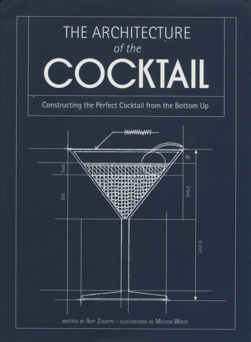
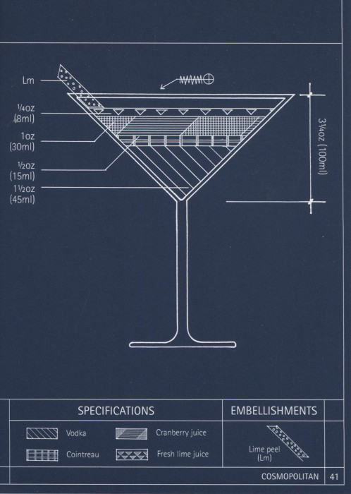
In The Architecture of the Cocktail, you will find 75 cocktail recipes, both classics and new ideas, presented as graphics. Like this “diagram/recipe” for the Cosmopolitan:
Yes, for each cocktail there is a list of ingredients and instructions but this accompanying diagram is what I love. You immediately see the relative proportions of vodka, Contreau, cranberry juice and lime juice in the drink. Sure, you can do that by reading the list of ingredients and then — this is important — doing the mental math so you realize there is 3 times as much vodka and Cointreau. Or, you can just look at the diagram and immediately “see” the balance of ingredients.
I love being able to “see” my cocktail. It gives me a quicker, more instinctive feel for what are the flavor drivers in a Cosmo and to suggest how I might do a little modification. What will that drink look like if I double the cranberry juice? I can “feel” by just gazing at this diagram.
The Architecture of the Cocktail is surely clever. I think it is more, a ground breaker that may well point to the new directions will be seeing in our cookbooks — cookbooks designed for Twitter generations.
Oh, kudos are due to the book’s wonderful illustrator, Melissa Wood, who we are told makes a wicked Bloody Mary. You should see that diagram!


Wow! What a delightful review. Thank you for such enthusiasm. Cheers!
m.