Cookbooks and web pages appear using some font to let each word gracefully take its place. Poor font selection — the wrong style or the wrong size or the wrong color — can make reading a recipe a chore. Perhaps too much of a chore to even finish reading that recipe or to give it a try. A bad font can bury a good recipe.
Fonts are something you are probably do not think about too often. In fact, great type designers say that the best font designs are ones the reader does not notice. That sounds a bit un-egoish on their part but font designers are, by nature, most quiet men and women who relish praise from their peers but truly do want the “font” to be the most important thing on the printed page. [Yes, there are flamboyant exceptions to that modest profile, but that’s another blog].
The creation of new fonts proceeds at a breakneck face. Why do we need more? Is there really a difference between serif and sans serif. Does it all matter?
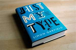
In the book Just My Type author Simon Garfield takes you on a tour of fonts from Gutenberg forward, a history that will appeal to anyone who loves the written word. Whether that word is on a printed page, a billboard, or a computer screen the fonts that are used for the message have subtle but powerful importance.
Font development can involve intense psychological and scientific testing and development. For example, the fonts used on road signs and subway stops in this country, the United Kingdom and France have all been the product of tremendous effort, with an added influence of local culture. The French, for example, turned down a great font option for their subways because it was too “British.”
Fonts are important because they make reading easier, or harder. Font size determines the length of a line and how many words can be put on that line. And studies have shown there are optimal lengths for a line to facilitate reading.
Font usage and development is dependent, in part, on history. Font progress is often a matter of evolution, rather than revolution. People are “used” to font styles and rebel if a shift is too great.
Or perhaps even if that change at first seems not too great at all. The sans serif font Future was introduced in 1927 by Paul Renner, a famous name to font addicts. An equally famous designer, Mathew Carter, introduced the font Verdana for Microsoft in 1996. Verdana, which you may have used, was meant to be a sans serif font, like Futura, but honed for small sizes on computer screens. Futura has been an institution for signage and books for over 80 years.
In 2009, Ikea switched from using Futura to Verdana in its print catalog. Their reason was to have uniformity in print and web media. The change was simply one sans serif font for another. Yet, there was a storm of resentment in the design community, one that made the pages of The New York Times. While fonts are supposed to be oblivious on the page, they inspire true passion.
You’re reading this blog now and the font is Calibri. In 2002, designer Lucas de Groot was contacted by an intermediary saying that a “big corporation” wanted a new sans serif font for their computer software products. How many “big corporations” are there in software land?
The client, of course, was Microsoft. De Groot’s lovely creation Calibri replaced Times New Roman as the default font in Microsoft Word. It replaced Arial as the default font in Excel and PowerPoint. Calibri is now the most widely used font in the world. You probably did not know that, but you also probably have seen hundreds or thousands of documents and web pages using it. Calibri has become part of the landscape of our lives and our times. When change finally comes, and it will, you just might hear about it.

