I am a big fan of infographics. These are the “information graphics” we see more and more, particularly in print and on the web. Early trends in this style of presentation began with USA Today. The paper was derided at times for the “comics.” Today, the comics or pictures or infrographics fill the pages of our newspapers and appear more and more on the web.
We are increasingly a society that “looks” instead of “reads.” We all come to rely on pictures now as the easier — perhaps even the better — way to grasp a complicated information landscape. This book is one of a series from Hachette Book Group. History, sports, and other complex topics are cleverly graphed and diagramed for our education and our pleasure.
These charts are often “one-offs” where the graphic deals with a topic so particular that no other graphic is going come close to mimicking it.
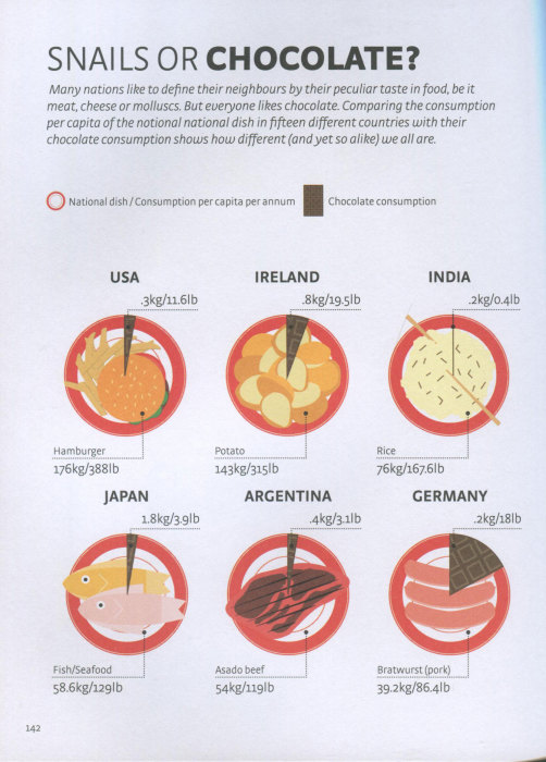
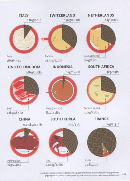
As an example, here’s a food graphic. Every country has a dominant or favorite food. And in every country people eat chocolate. So, what’s the ratio between that favorite food compared to chocolate?
This comparison covers 15 different countries around the world. I’m glad I don’t live in India. I’m a little envious of the chocoholics in Great Britain and, good lord, Switzerland. All those stories about the Swiss and chocolate
Yes, if you are geek and can translate between kilograms and pounds, you will notice that the kilogram figures for chocolate consumption are completely wacky. The pound numbers look good.
See, another reason to never adopt the metric system.