Well, this isn’t exactly a cookbook review. But it’s about what makes many of the books and products you use immediately recognizable. It’s the font. In particular, it’s the Futura font.
Created in Germany by Paul Renner in 1927, Futura went through several iterations before its final form was first completed that year. Today, you can grind out a new font on a computer in minutes. Back then, they were hand crafted on drafting boards by artists. I said “first completed” because that initial font was joined by other sizes and styles, like Italic. An ever ascending tree of Futura-like fonts.
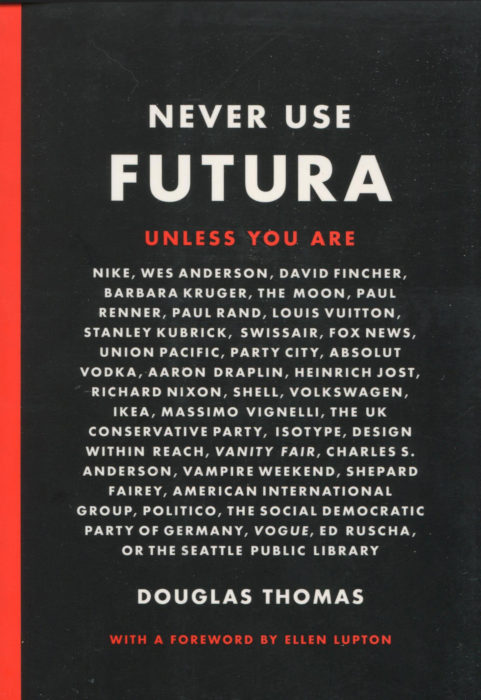
Never Use Futura tells the story of the font’s creation and its dramatic rise as “the” font for so many people across the planet. For decades, Futura was the sans serif font of choice. Then, in 1957 we got Helvetica and later Arial thanks to Microsoft. Still, type designers gravitate to Futura for a beauty that can be readily seen but not readily described.
You may ask, “Have I ever seen Futura?” Well, let’s see. Have you ever seen an add for Nike, Louis Vuitton, Swissair, Party City, Absolut Vodka, Shell, Volkswagen, … Ah, you see. Futura is in our life every day. All kinds of Futuras. Volkswagen, for example, is one of many firms that have commissioned their own private version of Futura. Little tweaks to individual letters like the “e” or “g.” Small changes to heights or ascenders. Changes so small you don’t notice them. You are not supposed to notice them, to be aware of them. You are supposed to be influenced by them, being seduced by the easy manner of reading material crafted in Futura. Futura was and remains engaging for all readers.
When Americans set foot on the moon, the plaque left behind was in Futura, something Paul Renner surely could not have expected. A man of character, Renner was arrested by the Nazis, gained release, and fled to Switzerland. He died in Germany in 1956, the year before Helvetica began its surge as a competitor.
For some of us, Futura has no competitor. You’ll find it in cookbooks on your shelves. Cookbooks that you have found to be comfortable to read, where the words, the sentences and the paragraphs all seem to gracefully flow.
Just as Paul Renner intended. His story and the tale of Futura are beautifully presented in this book. You’ve read biographies in your life about all kinds of people. This can be your first font biography.