USA Today and The New York Times are famous for their infographics. Beginning about thirty years ago, the rise of graphics to portray information, instead of words, became integral first to those publications and then to ones across the nation. Infographics are now part of all our daily lives and contribute to that accelerated pace we seem to thrive on. Or survive.
Sometimes a picture can be worth far more than a mere 1000 words. This book comes from the very clever team at popchartlab.com. They are famous for posters devoted to topics ranging from baseball stadiums to whiskey. That team is astonishing in their ability to take a complex mass of information and reduce it to a single graphic. Or book.
Do you own one of those massive guides to wine around the world? You know, ten pounds and 800 pages. I have them. I browse, but I have a hard time reading them and then consolidating it all into my head. One very good one, for example, devotes 40 pages to the wines of Spain. Well, after reading that do you think I can recite what grapes are grown where. Do you think I have an easy idea imagining just where in sunny Spain wine is actually grown? And where it is not?
Here’s the graphic from The Visual Guide to Drink:
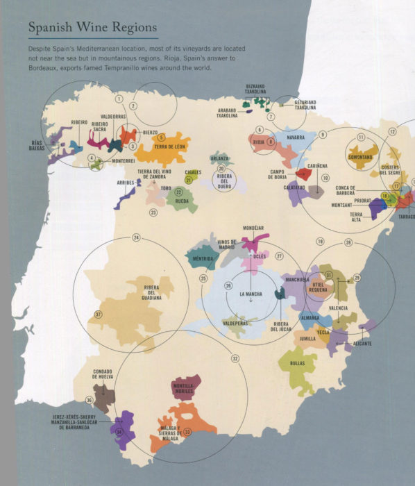
It’s all there: where the different wine growing areas are, what grapes are employed. All presented in picture perfect form that lets you immediately grasp the breadth of Spanish wine production. The book has similar graphics for other wine growing countries and, if needed, specific regions within countries [Bordeaux, Burgundy, Rhone, and Champagne in France, for example]
Besides this wonderful section devoted to wine, the Visual Guide has sections for Beer and for Spirits. The beer graphics include the process of beer brewing, a family tree of hops, and breweries of the United States with separate charts for the key brewing cities [New York, Denver, the Bay Area, and Portland].
For Spirits, there are charts showing the creation process for whiskey, vodka, gin, rum, tequila, and brandy. And, for each of those spirits, a map of primary cocktails you can make with that liquor. You can easily visualize the difference in components between that classic Whisky Sour versus Manhattan. True, this particular graphic does resemble a subway map, but it’s a delight to take a journey on its many pathways. I do wish I could show you this graphic, but it spans two over-sized pages and my scanner just can’t cope.
I guess, you’ll have to give in and get your own copy of A Visual Guide to Drink. From the very first graphic, How Yeast Makes Alcohol, you find this book indispensable. It surely is a guide but soon becomes a companion. My copy? It sits right between the bottles of tequila and dark rum. I’m sure you’ll find an appropriate home for your copy.